What is good UX?
Google Search — Still can’t beat this !

This is a part of my class Assignment at UW Madison.
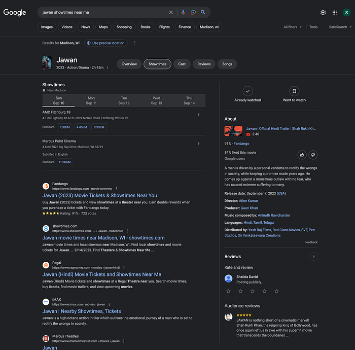
Recently, I attempted to purchase tickets for an Indian movie titled “Jawan” while in the United States. As a first-time visitor to the US, I was uncertain about the process. I decided to search for “Jawan showtimes near me” on Google. To my delight, the search results presented two nearby theaters that were screening the movie which were within 5 miles.

Google’s search results displayed showtimes, locations, distances, and all other pertinent movie details. What stood out as particularly remarkable was that when I clicked on a specific showtime, a convenient popup appeared, summarizing necessary information such as the screening time, accessibility options, and direct booking links to various websites.

With a simple click, I was seamlessly redirected to the appropriate webpage for the chosen theater and showtime, where I could effortlessly select my seats and complete the payment process.
I was thoroughly impressed with how seamless the booking experience was. As a user, I never found myself confused or uncertain. I always knew where the page redirection would take me, and the number of actions required to secure my tickets was minimized, thanks to the streamlined integration of Google’s search operations.
This experience served as a bright example of how a well-designed user experience can enhance and simplify even unfamiliar tasks, leaving users satisfied and confident in their interactions.
In the Week 1 presentation, it included the “Delete for Everyone” feature among its “Bad UX” examples. On the other hand, I believe it respects the recipient’s preferences, avoids misunderstandings, and helps promote responsible communications.
